

Philosophic Manga
Saturday, 23 March 2024For many years, every manga that I had ever encountered was simply lousy. I came to have little expectation that any were not, but I was aware of Sturgeon's Revelation,[1] and so I would still occasionally look at manga. Eventually, I found some that were quite good, and even a few that were brilliant. I'd like to mention two that I find very interesting as works of philosophy.
Philosophy in general is sometimes characterized as consideration of the True, of the Good, and of the Beautiful. I don't know of a manga to which I'd point as a worthwhile meditation on the Beautiful, but I can point to one manga that has interesting ideas about the True, and another that is a wonderful meditation on the Good.

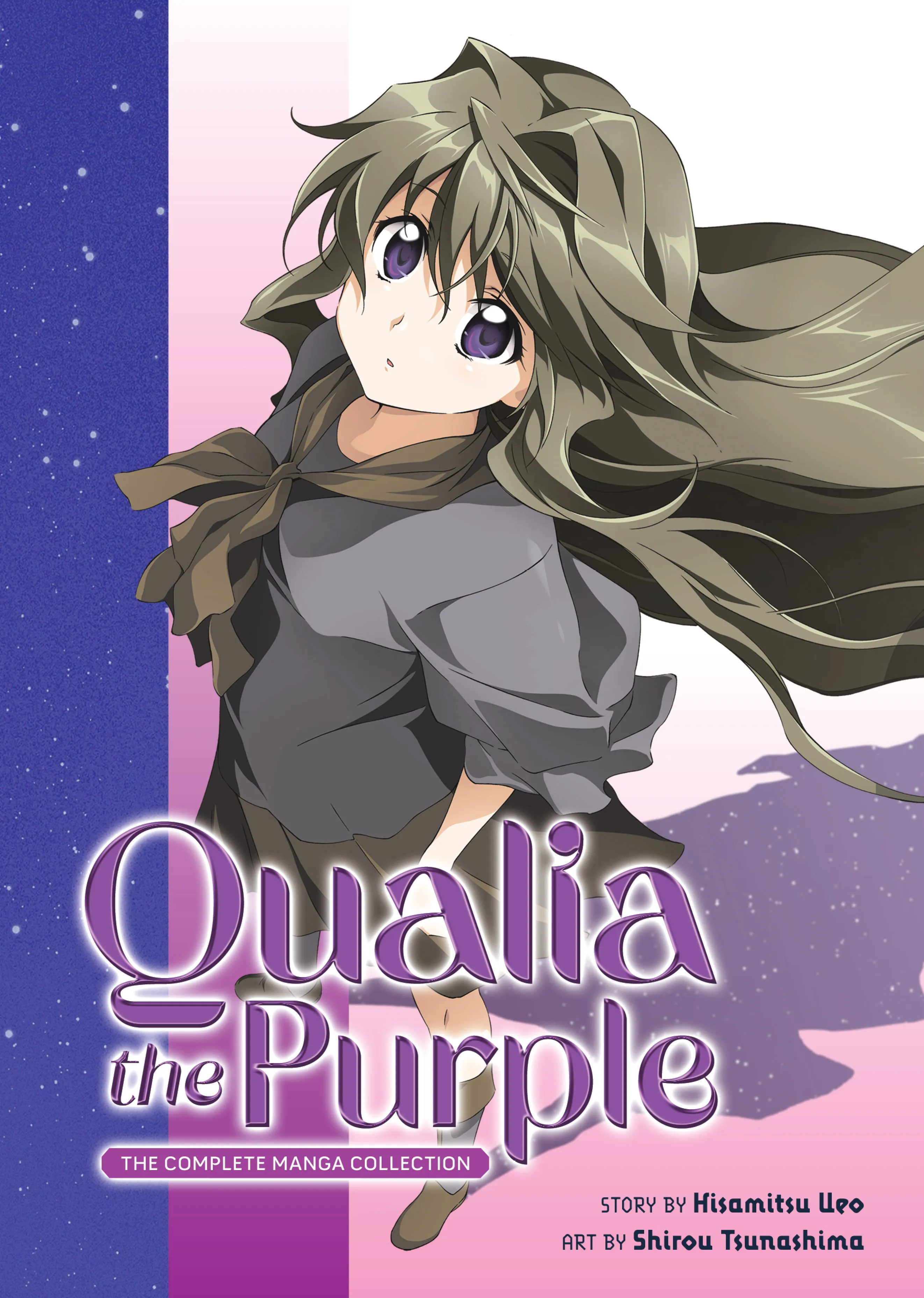
The official English-language title of the light novel 紫色のクオリア [Murasakiiro no Qualia], by Ueo Hisamitsu, and of its manga adaptation (by Ueo with illustrations by Tsunashima Shirou) is Qualia the Purple
, but a better rendering would be Purple's Qualia
or The Qualia of Purple
. The story is marketted as yuri (work with a theme of romantic love or sexual attraction between females), and it has some elements of that theme, but most readers primarily seeking that theme are going to be generally frustrated.
The actual primary theme of the story is the uniqueness of the epistemics of each person. In response to the same stimuli, we have different sensations, and construct models that are very different not only in these building blocks but in subsequent structure. In the best cases, our models of the external world correspond very well to reality, and thus indirectly the models of one person correspond well to the models of another. But the maps are not the territories, and my maps are not your maps.
In Murasakiiro no Qualia, the character Yukari does not model animals and machines as fundamentally different. However, unlike a couple of other characters, Yukari does not think any less of living creatures for being machines; she treats machines with genuine affection and sometimes love. Moreover, within the framework of the story, Yukari's model works. (I deliberately refrain here from providing examples.) Another character, Alice Foyle, produces what appear to be child-like drawings but contain solutions to challenging mathematic problems.
Ueo doesn't simply write of characters with special abilities flowing from looking at the world differently. Ueo proposes the idea that personal identity itself is located exactly in our respective internal differences of sensation and of all that we build from sensation.
The story also involves elements of speculative science fiction, to which I impute no value except as plot devices. I'm rather more interested in how the protagonist, Gakku, obsessively fights Fate, much as does Homura in Mahou Shoujo Madoka Magika.
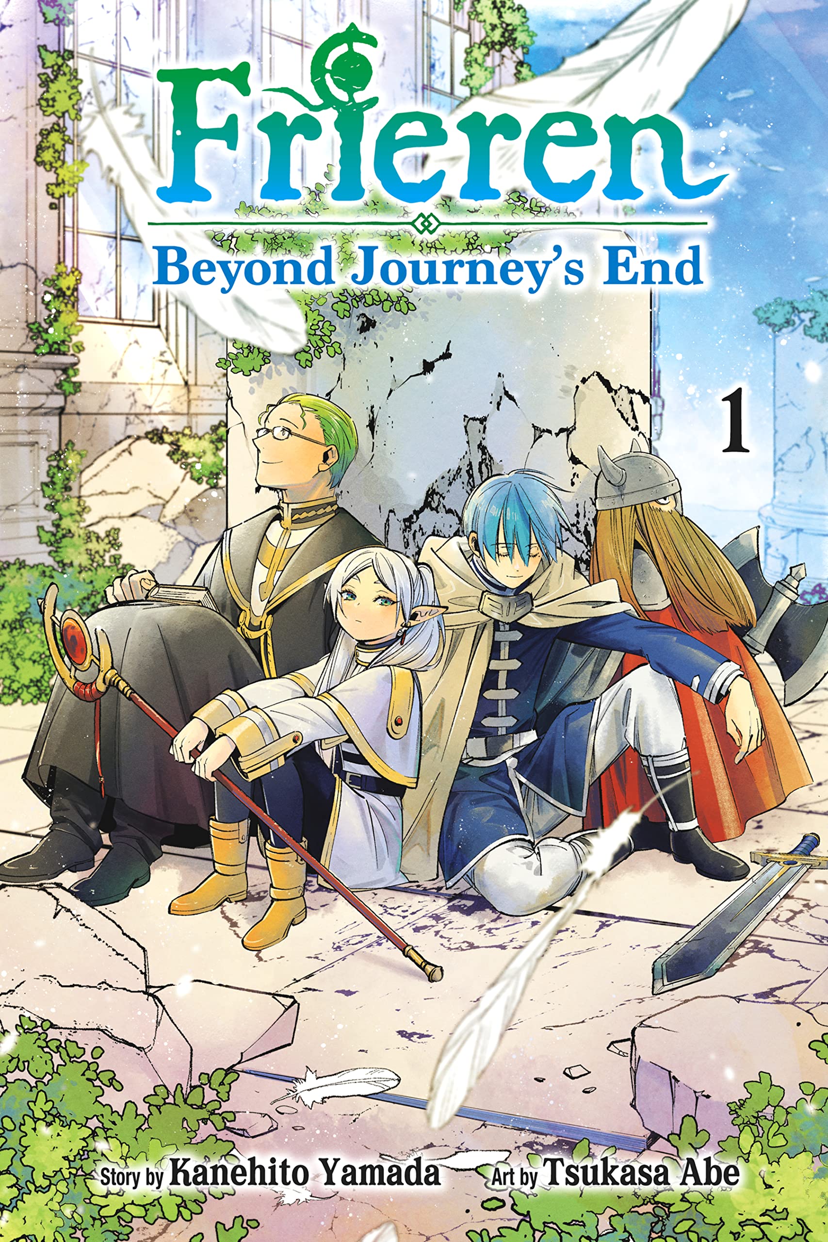

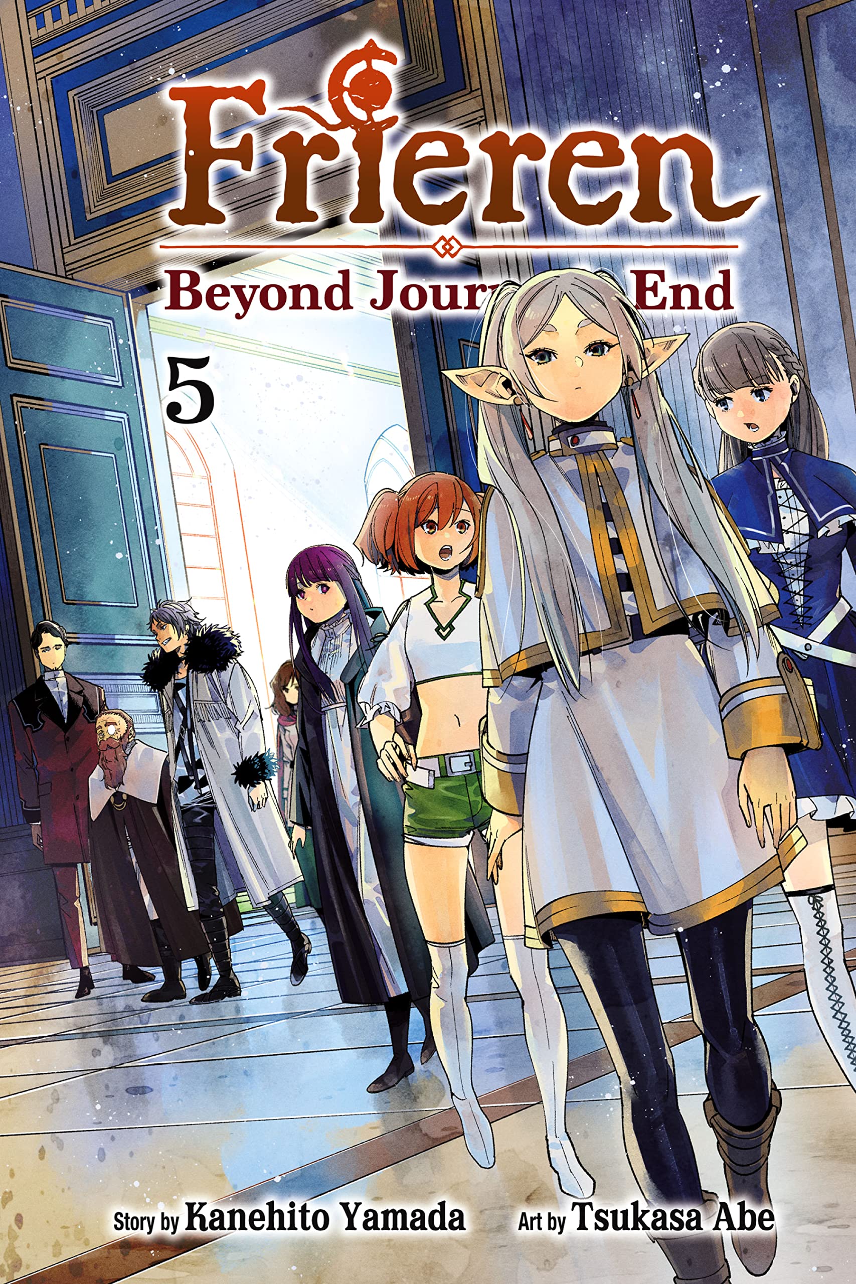
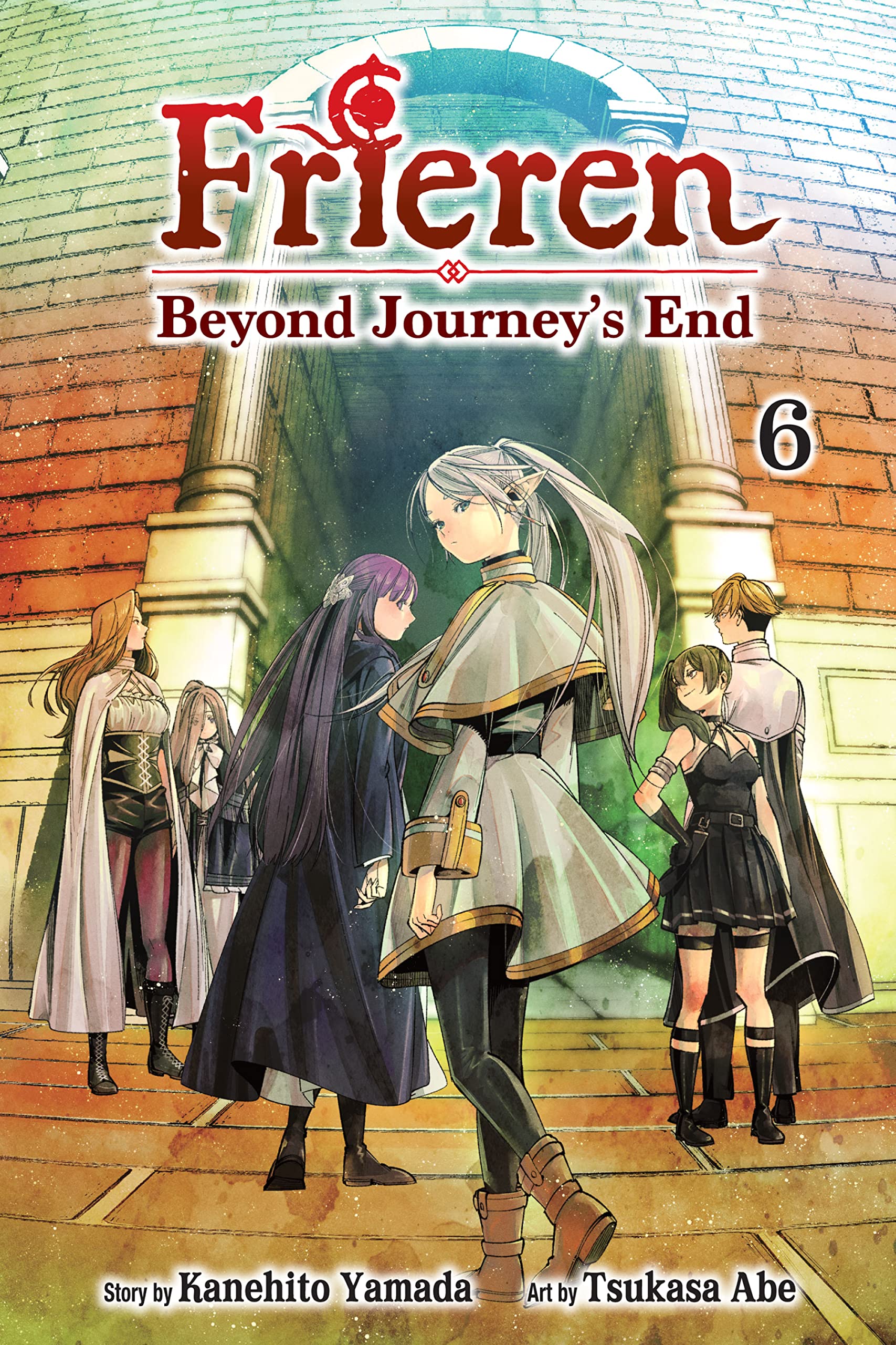
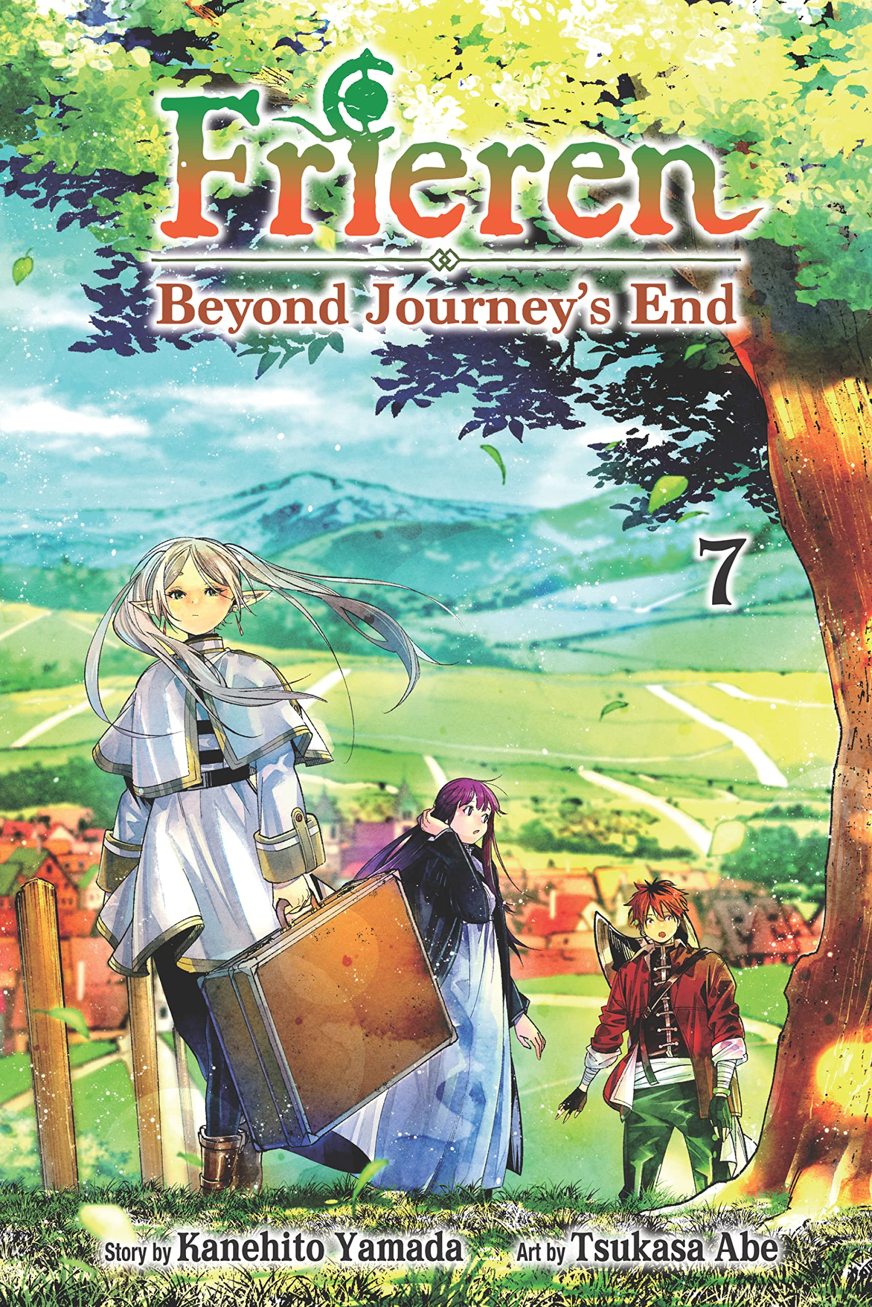
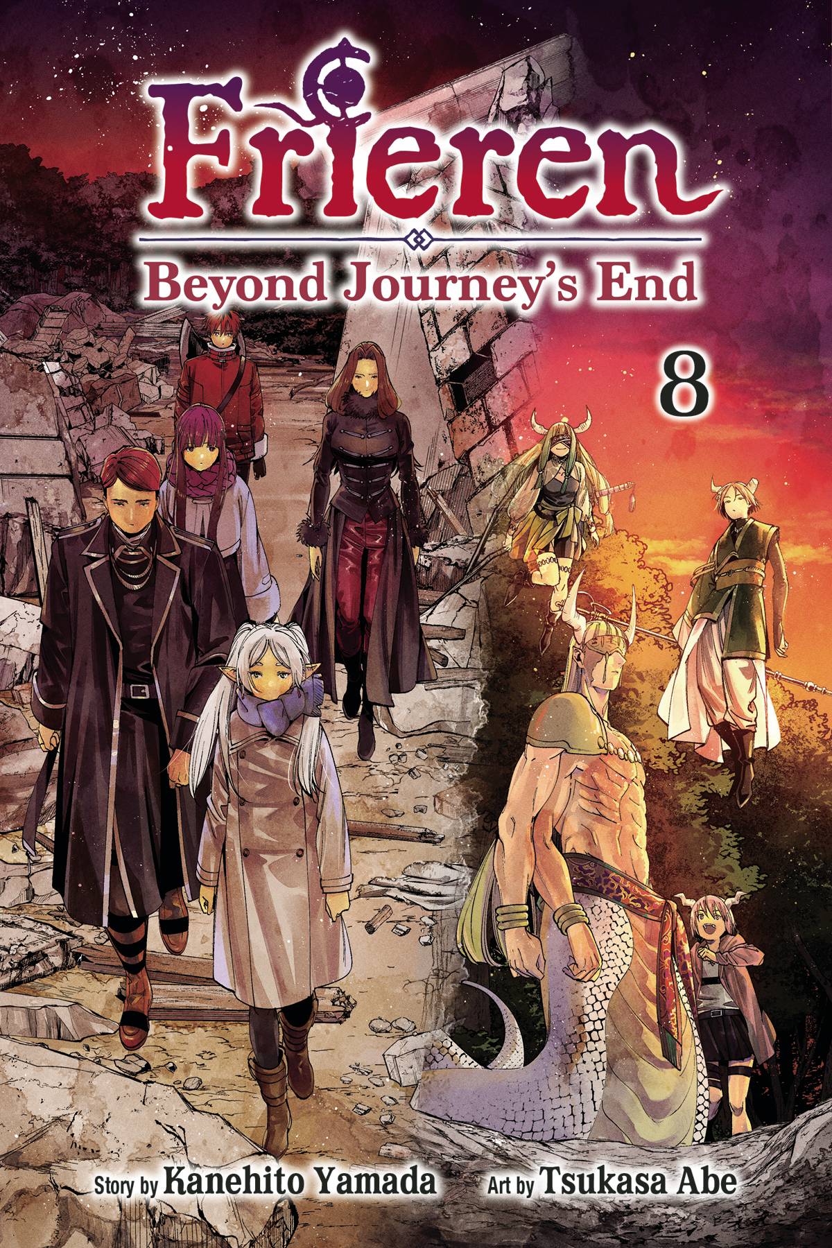

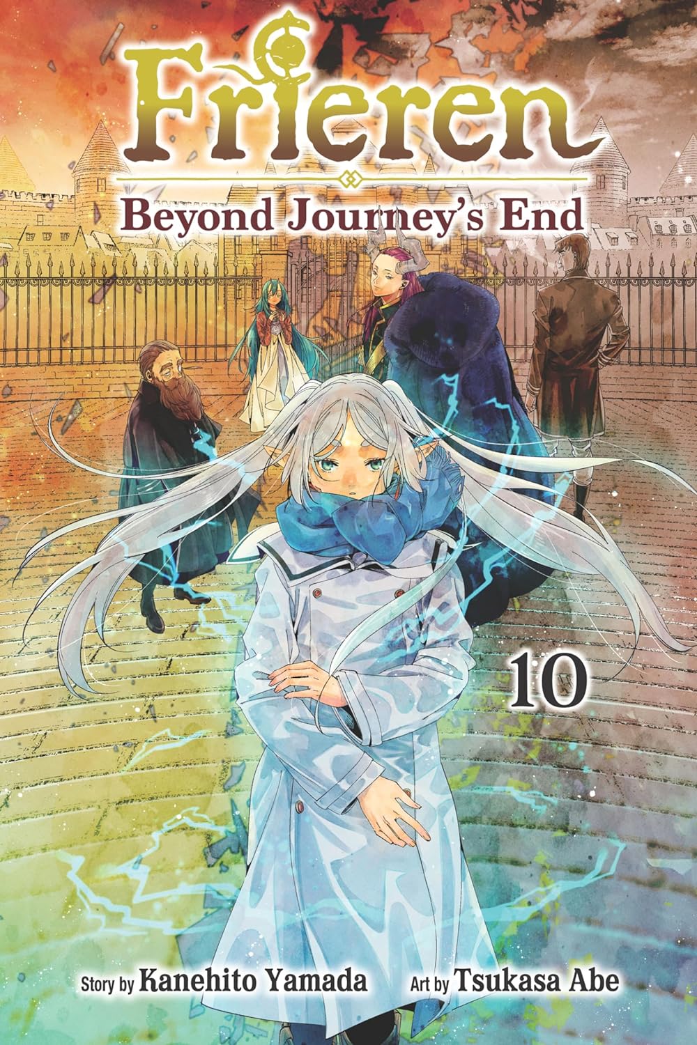
The official English-language title of 葬送のフリーレン [Sousou no Frieren], by Yamada Kanehito with excellent illustrations by Abe Tsukasa, is Frieren: Beyond Journey's End
, though the pirate translations began with the closer translation Frieren at the Funeral
; either of these titles is appropriate. (A more literal translation would be Frieren of the Funeral
.) This series has become a huge critical and commercial success, and its anime adaptation has likewise become a huge critical and commercial success. (At this time, I've watched only clips of the anime.) Frieren begins with the return of a party of four adventurers after they have saved the world from a Demon King, a quest that they accepted a decade earlier.
The eponymous Frieren is an Elven maga, who had lived a quiet, meandering life for more than a millennium before joining the party, and who can expect to live many millennia more. During the celebration, Frieren casually makes plans to meet the other members of the party, in another fifty years. The significance to human beings of half a century does not begin to register with her until she returns, and finds Himmel, the once youthful leader of the party, to be an old man. And, when not much later Himmel dies, Frieren struggles to understand both how someone with whom she had spent only ten years could have come to mean so much to her, and how she could have failed to recognize that she had only another fifty or so years which she could have spent with him and did not.
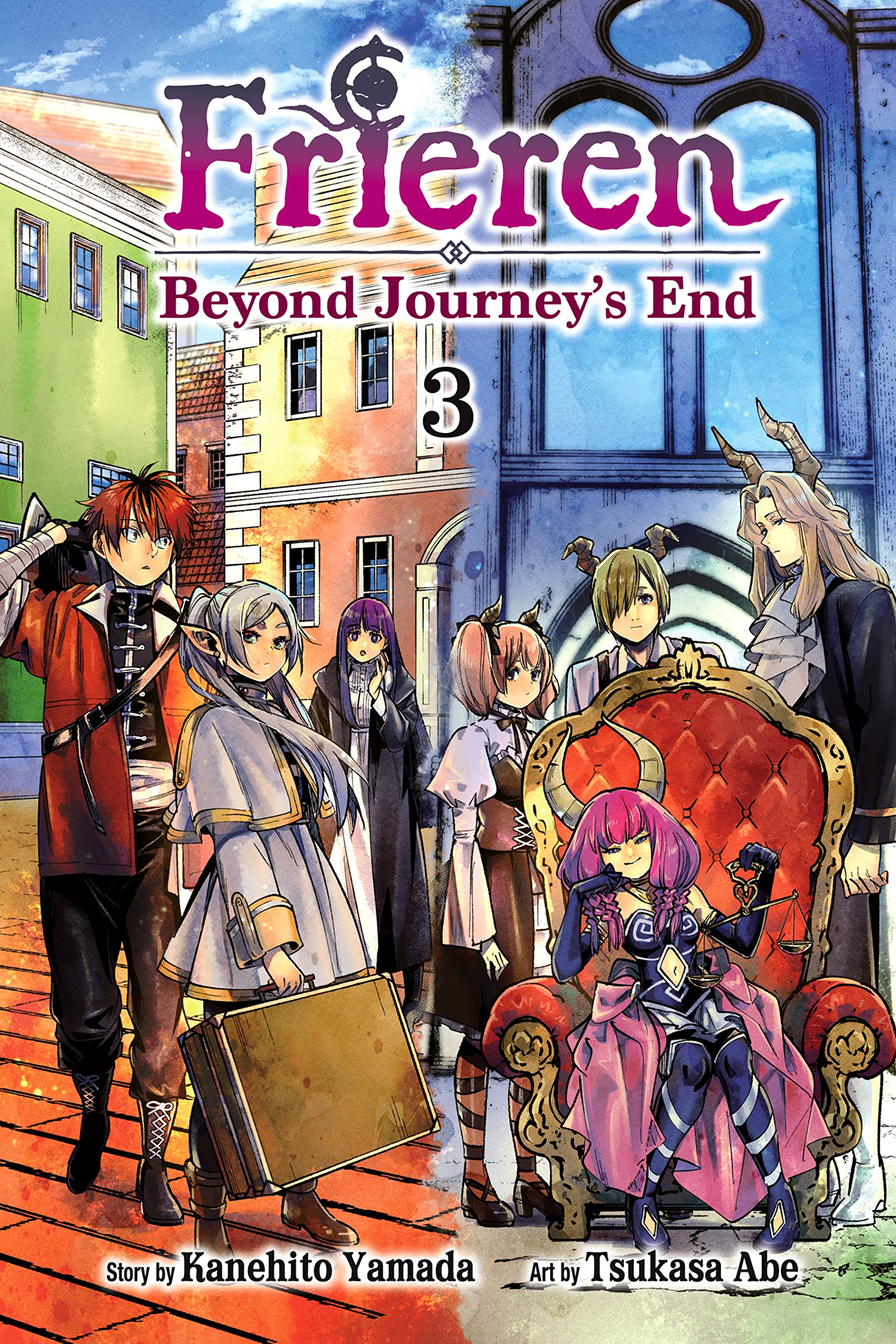
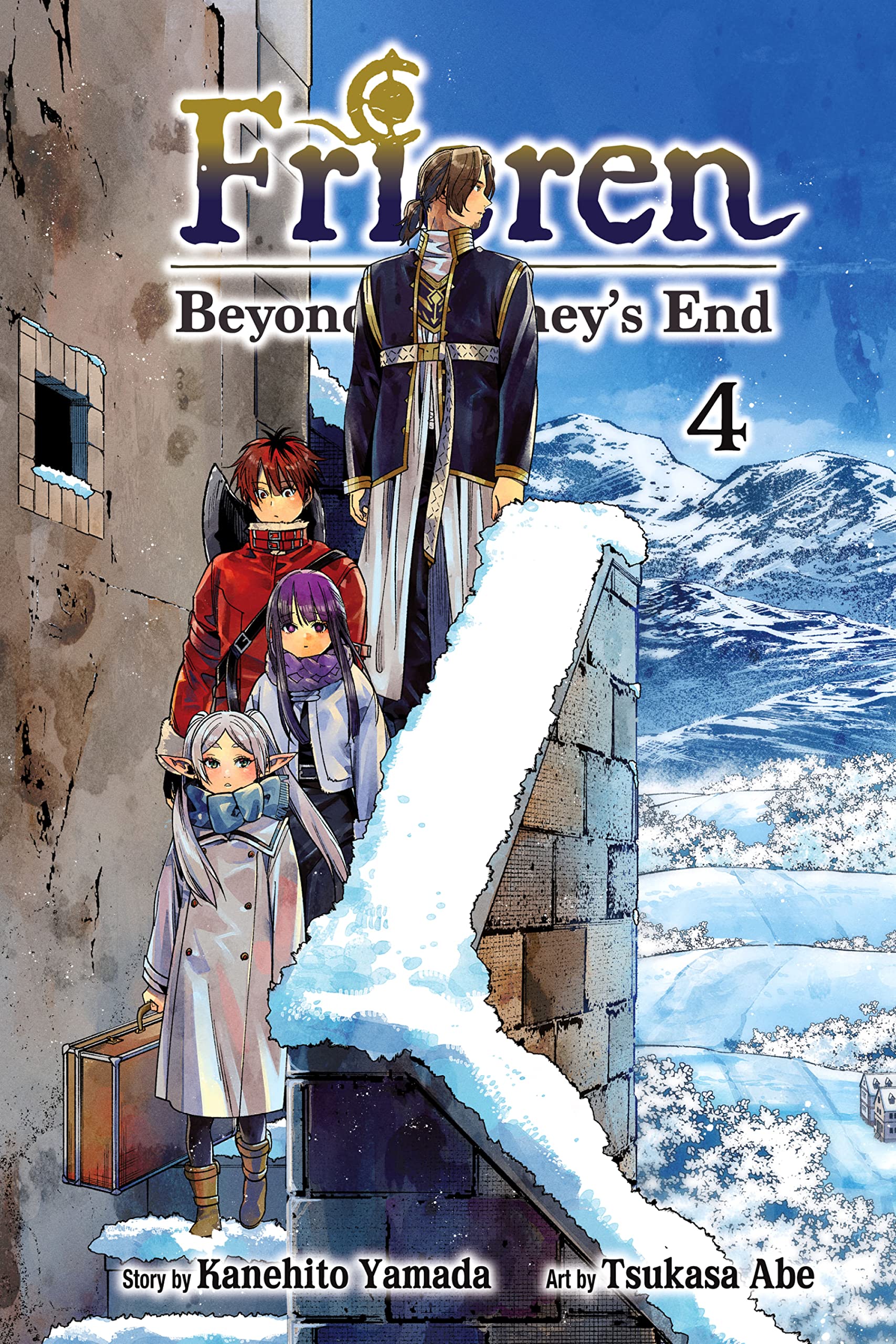
Thereafter, Frieren is the story of the further adventures of this Elf, with occasional flashbacks to her time with the party who defeated the Demon King. What's really being delivered is both a bitter-sweet love story — as Frieren comes over decades to recognize that Himmel was the great love of her life — and an extended meditation on the importance of relationships, on the meaning of life, and on the nature of ethics. (The other commentary that I've encountered has missed both the point that Frieren loved and loves Himmel, and the consideration of ethics.)
As to ethics, I'll note that Himmel implicitly rejected the Utilitarian calculus and anything like it, and within the story the ethics that he instead embodied have, since the time of the quest, been propagating. Humans and Dwarves explain their acts of local goodness by saying That's what Himmel would have done.
The world of Frieren continues to grow more humane, because of Himmel, long after his death.
Sousou no Frieren is a story that has more than once made me laugh aloud, not because of any jest, but because the author has made some excellent choice, often in having a character do something very right, but sometimes the author's choice involves other things. At least twice, his choice has concerned the rôle of Fate — once to challenge a character, and at another time to treat two of the characters with love.
[1] Ninety percent of everything is crud.
Sturgeon did not claim that 10% of everything is not crud; the ninety percent is merely a lower bound. (And a metaphoric one at that, though I encountered one fool who tried to argue as if the legitimacy of Sturgeon's Revelation hung upon a literal interpretation of ninety percent
.)
![[image of archaic header lettering, white]](http://www.oeconomist.com/blogs/daniel/wp-content/uploads/2016/05/header_000.png) but, for a while, the graphics looked like this
but, for a while, the graphics looked like this ![[image of art-deco header lettering, metallic with grey borders]](http://www.oeconomist.com/blogs/daniel/wp-content/uploads/2016/05/header_010.png) and then like this
and then like this ![[image of art-deco header lettering, the larger being metallic with grey borders and the smaller being white with grey borders]](http://www.oeconomist.com/blogs/daniel/wp-content/uploads/2016/05/header_011.png)


![[Wilma by Molly Kiely]](wp-content/uploads/2013/09/Kiely_Molly_DeeringWilma.jpg)
![[image of nude dancer, by Maurice Goldberg, entitled 'Ariel', modelled by Dorothy Lee]](wp-content/uploads/2011/10/Goldberg_Maurice_of_Lee_Dororthy_as_Ariel.jpg)
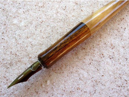
![[image of a dippen whose holder is made of blackwood and alabaster]](wp-content/uploads/2011/09/dippensblackalab_761x547.jpg)
