

Lies, Damn'd Lies, Statistics, and…
29 November 2009In my previous entry, I noted that, as the Gallup report of the President's approval rating approached 50% from above, there was an asymmetry in its perturbations, that it skated the 50% line, without blipping below it, for an extended interval. And I noted that, as the disapproval rating approached the approval rating from below, it tentatively seemed to be displaying a complementary asymmetry, plateauing when it might be expected to rise further. 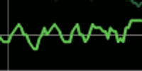
Indeed, that reported plateau was stretched for a full week. 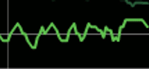 If you'll look at the previous reported figures for the disapproval rating, you'll see nothing like it.
Tags: Barack Obama, Gallup, Obama, polls
If you had access to the raw data, then data manipulation can be easily proven using something as simple as X bar/R charting of the period in question. If whomever is responsible for the Gallup chart is so brazen as to manipulate data in order to A) have the approval and disapproval charts reverse-match so carefully (which, we both know, is highly unlikely to happen naturally) and B) limit the approval rating in several areas so that it does not actually go below 50%, then my guess is that whomever it is, is probably not smart enough to make the data fit and work in a control chart environment.
The Gallup Organization has not made the raw data available, nor do I expect that they will.
If data were released, I suspect that so much chaff would be thrown in the air that few people would be able to negotiate the confusion. No matter what competent analysis actually showed, there'd be some professor of statistics somewhere arguing quite the opposite.